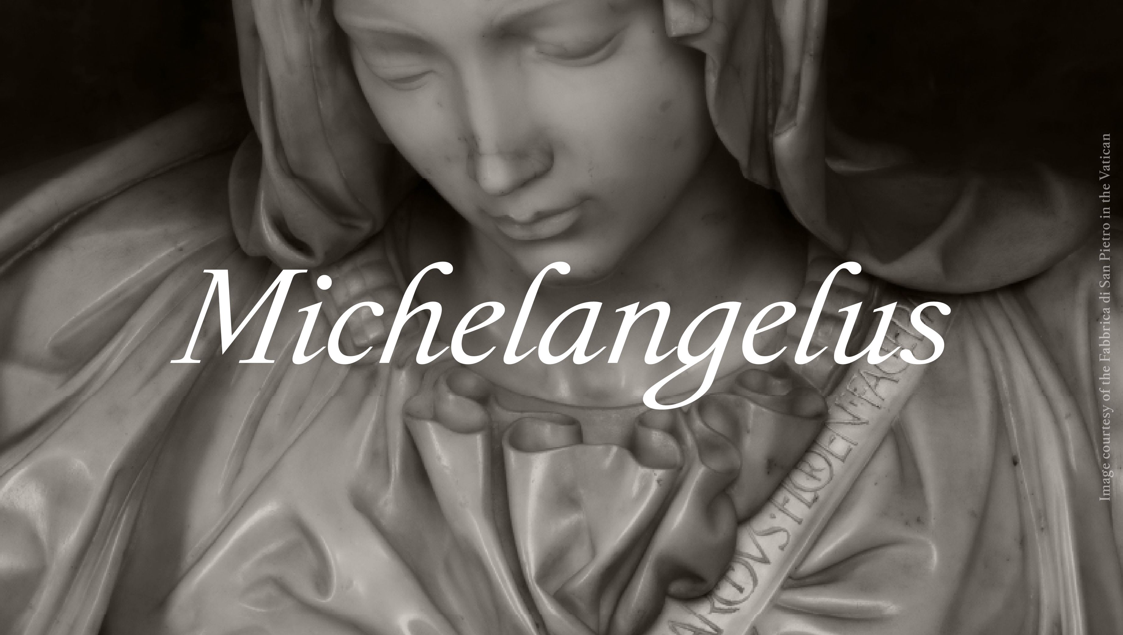
Vatican City, October 8, 2026 – Commissioned by the Fabbrica di San Pietro and created by studiogusto®, it has been developed for the Microsoft 365 Office. Over 500 glyphs and four styles transform the artist’s handwriting into a system that is accessible and free to use worldwide, creating a dialogue between historical heritage, design and technology.
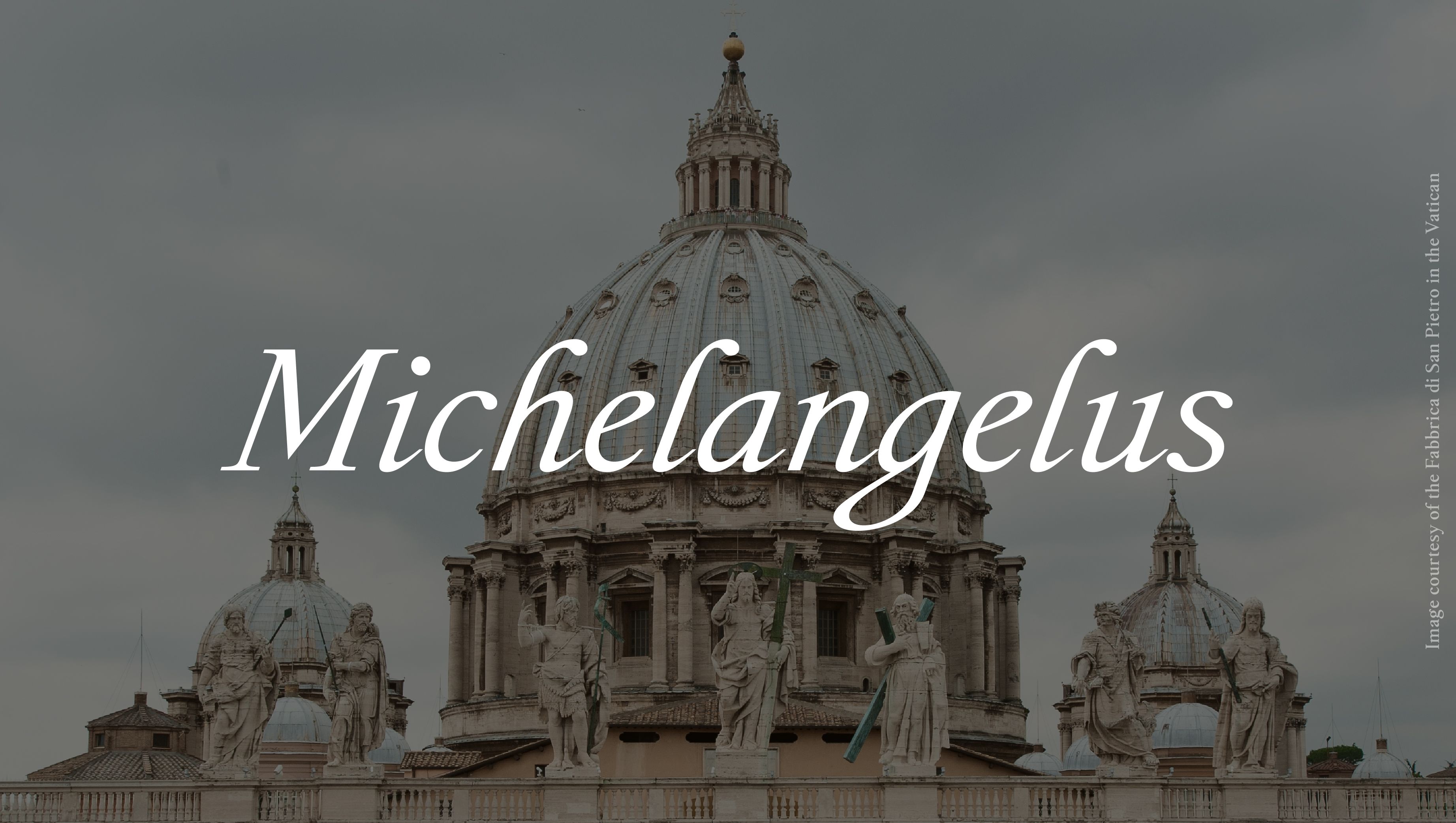
No artist is more intimately linked to the extraordinary history of the Fabbrica di San Pietro than Michelangelo Buonarroti. His Pietà and the dome of the Basilica stand as universal, enduring testaments to this extraordinary connection. Today, his pen strokes and handwriting have been transformed into a contemporary typeface. The result is Michelangelus, a new typeface created by studiogusto® and joining the Microsoft 365 Office Font collection. A contemporary typeface, rooted in cultural heritage and spirituality and developed through design and technology, it is the result of a meticulous process of research, design and testing, and is accessible to people and organisations worldwide.
A synthesis of history, design and technology
Commissioned by the Fabbrica di San Pietro and created by studiogusto®, the typeface draws inspiration from Michelangelo Buonarroti’s bold, expressive handwriting. However, it goes beyond a mere reproduction of the artist’s graphic style and an imitation of his calligraphic techniques. The ambition is broader: to identify within his handwriting a visual logic, a system of proportions, rhythm and harmony measured by the artist’s eye, and to translate this into a contemporary typographic system.
Michelangelus establishes a connection between seemingly disparate realms: memory and innovation; authentic Renaissance manuscripts and modern software; the movement of the hand and vector drawing; archives of historical documents and the digital tools used daily by millions of people.
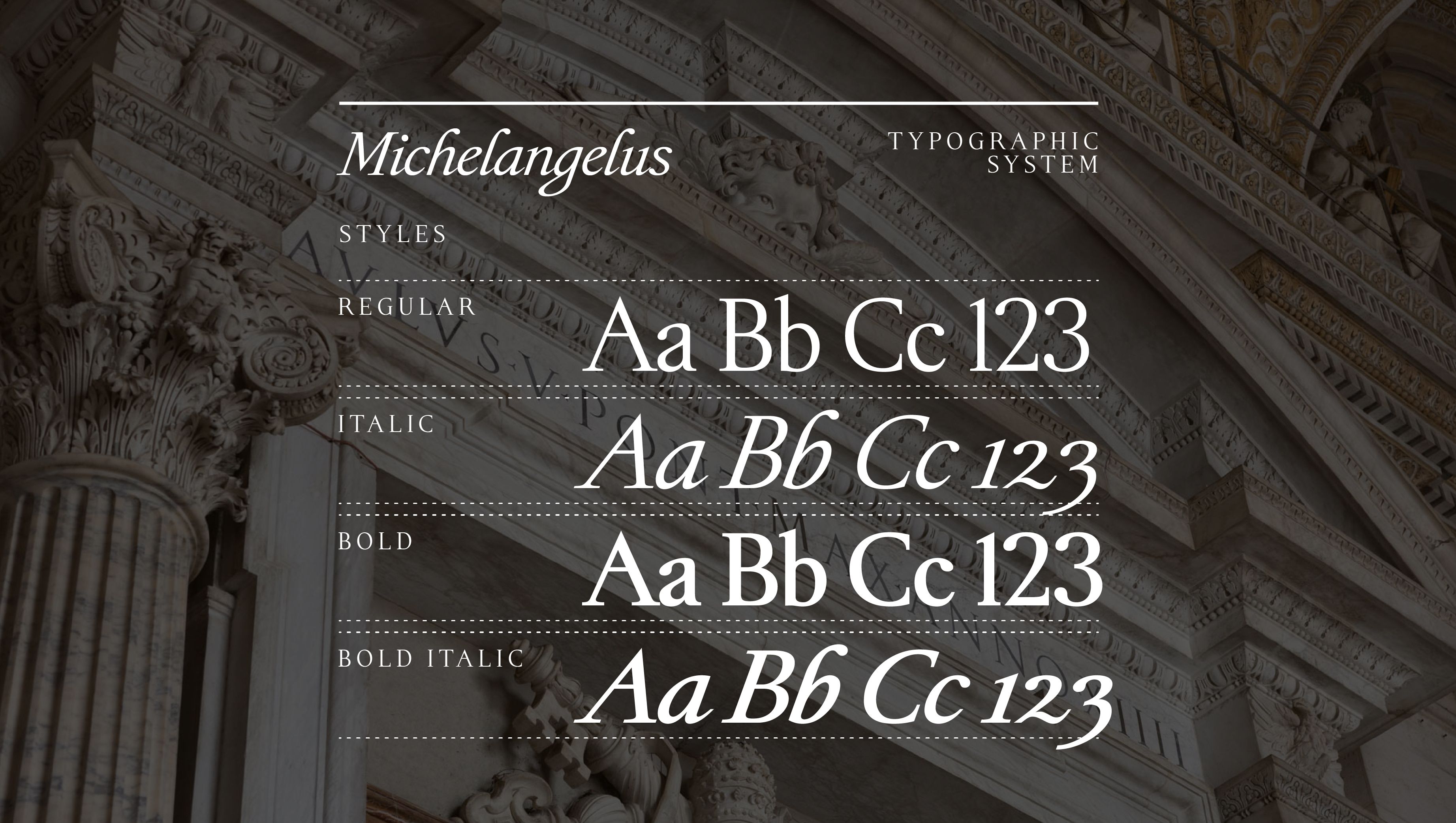
Following a meticulous process of verification and refinement, the Michelangelus typeface family comprises over 500 glyphs, organised into four main styles: Regular, Italic, Bold and Bold Italic. It is a complete typeface family with a distinctive identity, designed to remain legible and versatile across a wide variety of print and digital applications. It meets the requirements of a range of applications, particularly those within Microsoft 365 Office.
It is also available for direct download, allowing individuals and organisations to install and use it free of charge. This open access to the typeface is accompanied by a licensing model designed to safeguard the integrity and distribution of the typeface family.
The Michelangelus project is one of the digital initiatives entrusted to Microsoft by the Fabbrica di San Pietro in Vaticano to promote and enhance its cultural heritage.
Behind the design
From Signature to Form
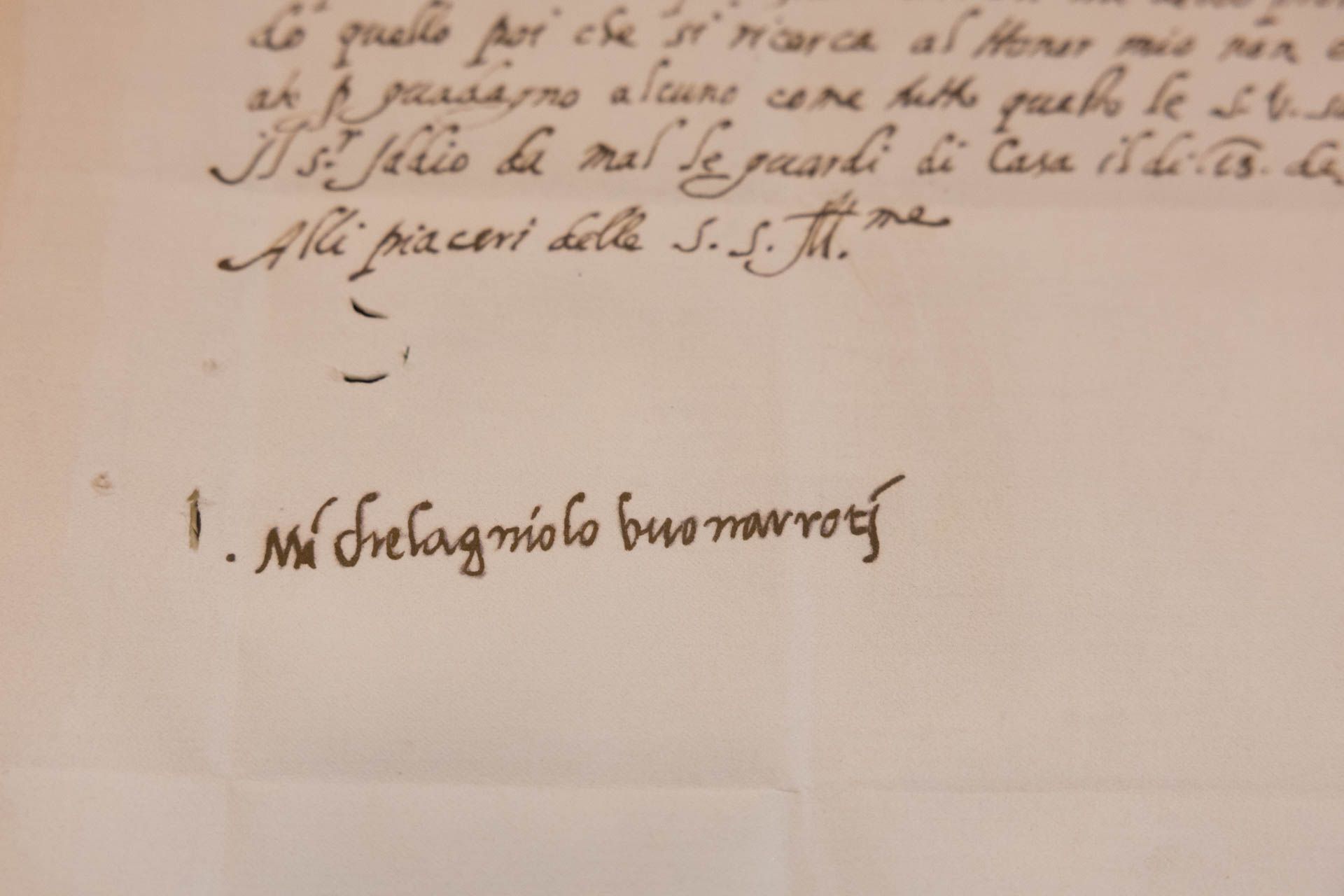
The project focused, first and foremost, on a less obvious aspect of Michelangelo’s work, yet one intimately linked to his personality: his signature. A signature reveals much about one’s character, as it encapsulates traces of the author’s gestures and personality.
There is a powerful tension between energy and control present in Michelangelo’s handwriting. This is evident in the density of the forms, the alternation between accelerations and pauses in the stroke, the strength of the lines, the relationship between curves and angles and, above all, his ability to organise empty space.
The project did not arise from an intention to faithfully reproduce Michelangelo’s handwriting, but from a desire to interpret its distinctive features through the language of typography. The concept was therefore developed through a process of analysis and interpretation: separating recurring patterns from random forms, understanding which elements, proportions and rhythms made his handwriting recognisable, and subsequently translating these into a typographic system.
Individual handwriting features irregularities and unique gestures; a typeface, by contrast, must rework these elements, transforming them into consistent criteria that can be applied and reproduced without losing the style of the original handwriting.
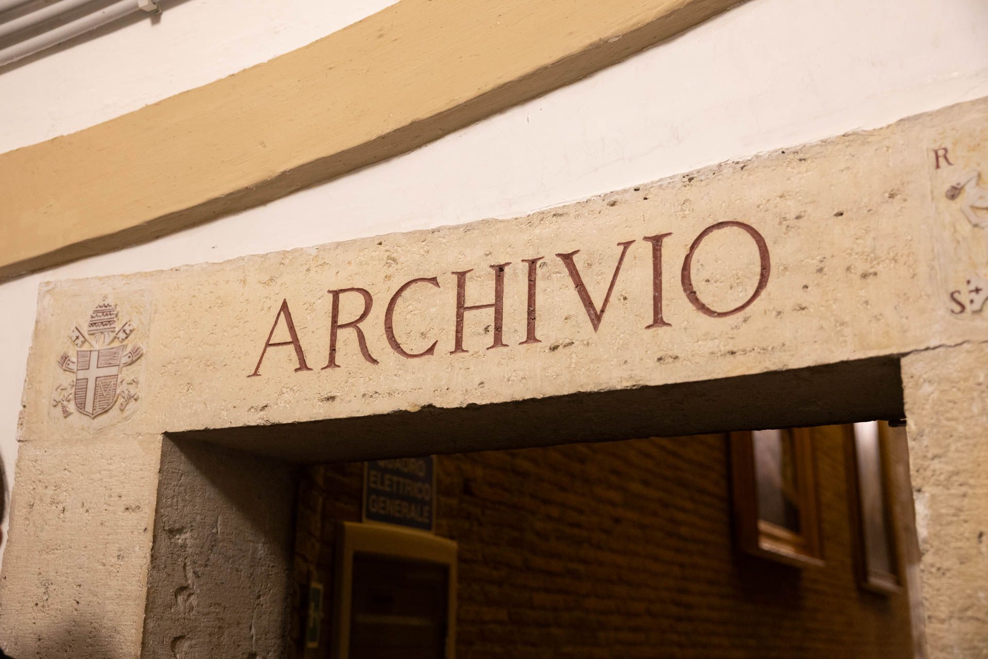
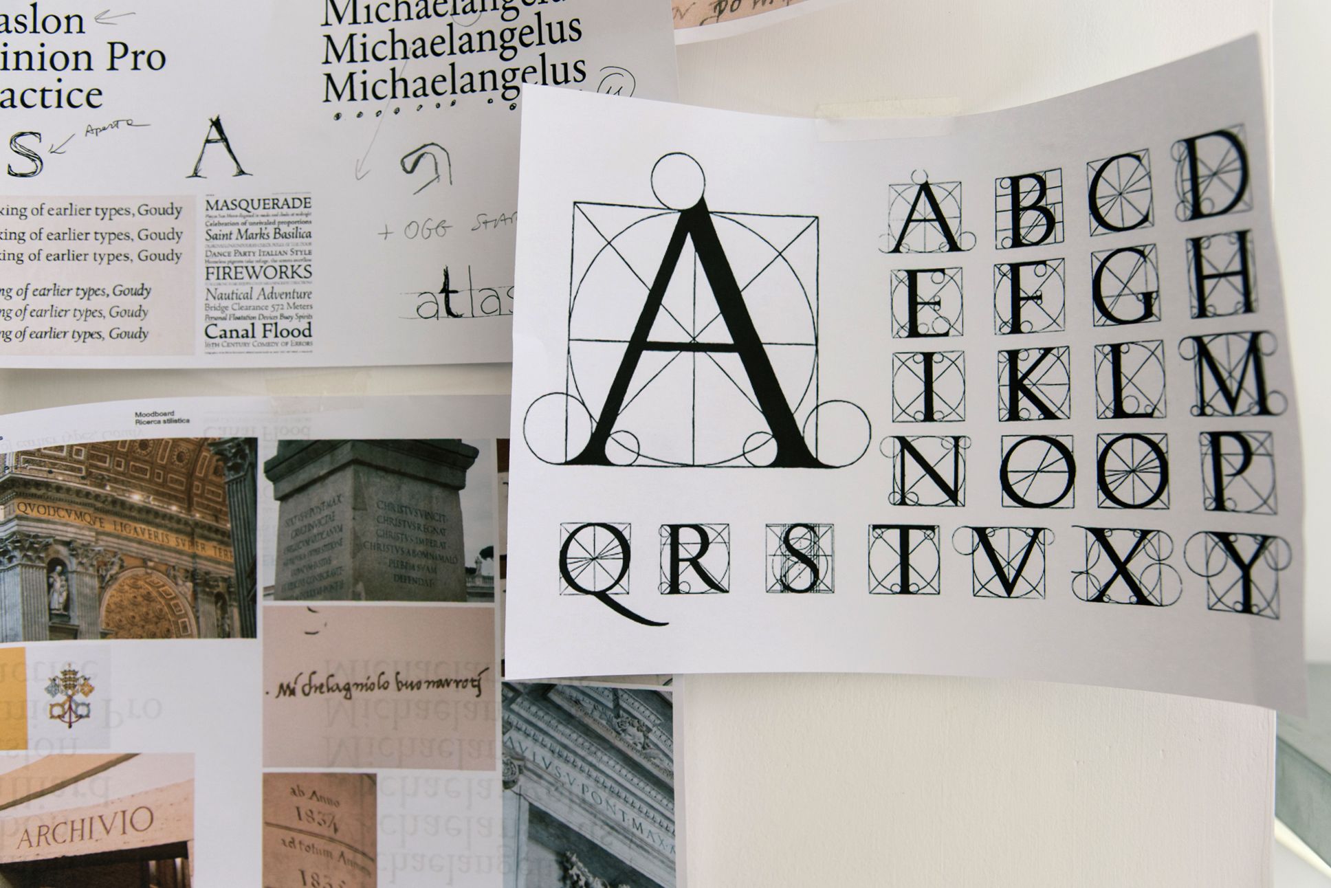
For this reason, the studiogusto® team carried out in-depth research, studying Michelangelo’s original documents held in the archives of the Fabbrica di San Pietro, the Vatican Apostolic Archives and at Casa Buonarroti in Florence.
The research moved continually between the personal and the monumental. Letters, notes and signatures revealed Michelangelo’s handwriting style, which exerted a strong influence on the lower-case forms of the typeface. The capital letters, on the other hand, evoke the monumental scale of his work – from the Pietà to the Dome of St Peter’s Basilica – creating a dialogue between the artist’s personal voice and the grandeur of his public works.
The relationship between personal expression and legibility – central to the transformation of handwriting into a typeface – is also curiously reflected in Buonarroti’s family correspondence. Michelangelo often wrote to his nephew, Lionardo Buonarroti, whose handwriting was a frequent source of frustration for him. In one letter, Michelangelo complained: ‘Do not write to me anymore: every time a letter of yours arrives, I come down with a fever from the effort it takes me to read it! I cannot imagine where you learnt to write. I believe that, if you were to write to the greatest donkey in the world, you would take more care than you do with me. So, do not add any more annoyances to those I already have.’ (Lionardo carried on writing and Michelangelo carried on complaining.)
The design team’s research made it possible to identify the elements that make Michelangelo’s handwriting recognisable, beyond the individual gestures of his hand. Several recurring characteristics gradually emerged: the construction of capital letters, the relationship between positive and negative space, the proportions of the forms, the consistency of the slants, the shapes of the terminals and the overall rhythm of the handwriting.
One of the most significant aspects was the emergence of an invisible order: even when the handwriting appears spontaneous and expressive, it retains a precise, almost architectural structure. There is an invisible grid that governs the strokes, creating a balance between vitality and discipline.
This principle has become one of the distinctive features of Michelangelus: a structure so rigorous that it allows the form to remain free.








Copyright © 2026 Basilica Papale di San Pietro - Photos: © Fabbrica di San Pietro e Vatican Media - All Rights Reserved.